So its been a long journey, two years of blogging. I can say that I've learnt alot throughout this process and I think I'll miss blogging (just a little though) and I want to thank the teachers for teaching me and to everyone I worked with. It was fun. And I'm kind of glad its over. BYE. :D
I think this is the shortest sign off ever. Oh well.
Showing posts with label Azeemah Mangera. Show all posts
Showing posts with label Azeemah Mangera. Show all posts
Sunday, 29 January 2012

Thursday, 26 January 2012
Evaluation: Question 4
4. What have you learned from your audience feedback?
On Tuesday 6th December all the A2 students went to 'Screen on the Green' in Islington to watch all our music videos. I remember it being fun from last year when we went to watch our thriller openings, so I was excited to see everyones music videos. Our video was the second one shown and it caught all of us by surprise because we weren't expecting to have ours shown until near the end. So I didn't manage to record it but people generally enjoyed it. It was interesting because I could spot all the little things that were wrong with the video.
For the most part everyone really liked the faces we had in the chorus as we used people from our college and the shots that we had of the London Eye at night. No-one really had anything for us to improve on except that the faces could have been all in equal space, as some had more background space than others.
I think its important to know how the audience feels about our video, because if this was for real you would definitely want to know what they think before you release it to the world. And because this is our first video, we would want it to be perfect in order to show our artist in the best light possible. Obviously we didn't have enough time to ask lots of people but in general if I was able to make changes and improve on it I would probably spend longer filming the shots I filmed, especially the moving ones of the London Eye, as they aren't steady at all. I would also film in better weather (obviously) and have more costumes and different looks for our artist as we only had one. If I had more time, I would develop the storyline in more depth. I think this wold make it look more like a conventional pop video.
Here is Viet and Mehdi giving me feedback on my advert and album cover. They had similar opinions that my album cover and advert were quite good and there is a clear link between them. They also had the same view about my inside cover, that it could have been better because it looked plain. I agree with them as I already knew the outside cover was much better than the inside, so I was prepared for them to say this. If I was going to do it again then I would get a really good picture of the London Eye and make it spread over both covers. I would also give the CD a design that linked to both my ancillary products.
When we finished our video on final cut pro, before we published it we got some feedback from people just to make final checks that we hadn't missed anything. We asked throughout the process of making the video, as we didn't want to make the whole video and then realise or have someone tell us that something didn't match up or a shot looked a bit dodgy. Some of the things people told us to change was to mix up some of the faces because we had at first put lots of faces from one location together.
Overall, I think our video was executed quite well despite all the obstacles we had.
Thursday, 19 January 2012
Evaluation: Question 3.
3. How did you use media technologies in the construction and research, planning and evaluation stages?


To film music video related stuff, like feedback and group sessions, we used FlipCams. They're really small and useful to have, whenever filming something important it was easy to just grab and film and upload. I used this to film feeback on my ancillary products and reactions to our music video after the cinema screening. Can you imagine having to carry around that big JVC around?


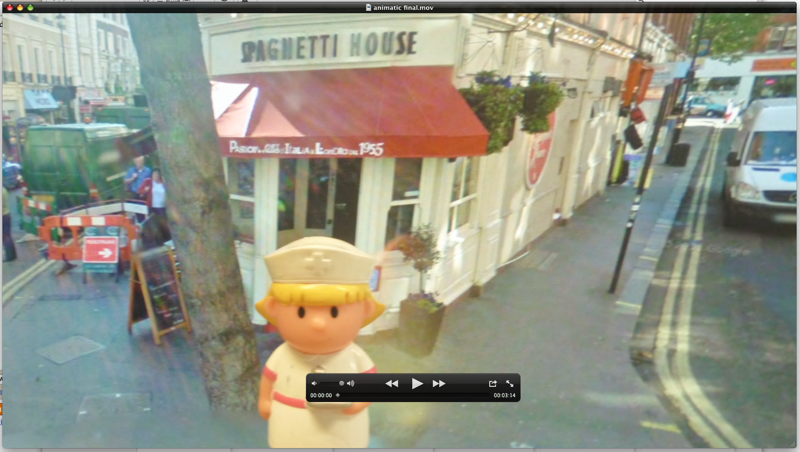
We created our animatic using the same program, but used Quicktime player to play it on. All the videos we had were watched on this program, something that just let you watch what you recorded really.


To make our ancillary products, I used photoshop. This allowed me to layer pictures and add text and effects to make the album covers and advert.


To present our pitch to the class, we made our presentation on Microsoft PowerPoint, where we were able to put all the information onto one document and present it to the class.


To document our journey we used digital cameras so we could take pictures of what we were doing so we could upload them on to blogger as proof. I used Prexi, a fun and interesting online website that allows you to create a presentations in a different form to answer a question.


Annnnnnnnddddd finally, the place where we stored and documented everything. The one and only, Blogger. We uploaded everything we did on here: from research to our pitch to editing sessions.

The amount of times I saw this when trying into log in. Worst nightmare.

Monday, 16 January 2012
Evaluation: Question 2
2. How effective is the combination of your main product (video) and ancillary texts (Digipak and Advert)?
Evaluation: Question 1
1. In what ways does your media product use, develop or challenge forms and conventions of real media products?
Kickstarts - Example


The first video that influenced our video was Kickstarts by Example. We liked the fact that the feet in the video was edited to match the beat, and we wanted to implement this in our video as well. We did this by editing our chorus with lots of different faces in time with the beat instead of feet as Example has done, therefore challenging the convention in his video. These were also obvious edits instead of continuous, as all the people were in different places, something which pop videos have.


Our entire video is edited to the beat of the song, but I think it is most obvious in the chorus. We had several base tracks that we started with to help us structure the video.
In our video we also used slow motion. As a group, we all agreed that slow motion was an effective edit to use and added a little something to the video. In the beginning we weren't too sure where we wanted to use it, but when we started editing we decided to put it in the bridge after the second chorus. We didn't really have a specific video that we were influenced by, but we saw it used in some recent pop videos and we learnt when researching Carol Vernallis' theory. This is what I wrote about her theory at the beginning of our blogging journey.

So among the conventions of a pop video, slow motion is one of them. One video that we looked at was Lat Friday Night by Katy Perry, who uses slow motion in her video. In this shot below, when she is walking down the stairs its in slow motion and is also using jump cuts.


We took inspiration from 'A-Team' by Ed Sheeran from this particular shot above where the main character is standing and the background is moving in fast motion. We liked this as it was a contrast to the usual slow motion (even though we used that in our video as well)


Our artist looks directly into the camera when singing to involve the viewer in the performance. This is done in almost every single video out there, whether its pop or not, to show the audience who the artist is because they are promoting them. The screen shots below show this, the promotion of the artist in the video. We also used our artist as both the singer and narrator, mainly because we didn't have a storyline that needed lots of separate characters. This example also works with the Katy Perry video as she plays a nerd turned chic as well as singing the song. As our video didn't have a proper full storyline, we didn't need a resolution at the end of our video. Our story was our artist walking around London and seeing different cultures and meeting different people who are a part of a contemporary 2011 London. This is in contrast to the Katy Perry video, which is set in 1980s America (shown through the use of neon colours and fashion trends in the video), which is a convention we challenged. Our video progresses from day to night, so perhaps the resolution is that it is the end of the end, therefore concluding the video. Which is similar to the Katy Perry video, which goes in a full circle from day to night into the next day.


Goodwin's theory and our music video are linked quite well together. This is what he says:

Our video is built around the song, we have used amplification for our video by not using our video to illustrate every single lyric in the song nor having a video that doesn't match anything in the song. We also used the artist as both the narrator and the character and had the singer look directly in the camera from time to time to involve the viewer.
As this was our first music video we have to promote our artist so there are repeated shots of our artist so viewers become familiar with the artists face, so when they see her advert or album they can recognise her.

The main artist I was inspired by for my album cover and advert was Kate Nash. I liked all her covers because they were a collage of both real photos and cartoons or drawn pictures. She inspired to make a collage type cover and I achieved this by photoshopping my cover so it looked like our artist was cut out and stuck on a staircase.


Production of the advert

For my advert I decided early on that I wanted to have the same picture on there as the one on my album cover so that people could make an easy link between the two. I think continuity is also very important. When I put the picture from my album cover onto here is was too small, so I played around with the canvas size but when I got to the size where the picture fit it was way too small. So I recreated the whole picture again on a bigger scale. It took a little while but I think its much better than having an advert that was too small. So then I moved onto adding in the text.

I decided to put in quotes from reviews instead of having tour dates because it would have been harder to place them on my advert without covering up the picture. I wanted to have 'Out Now' written on the step at the bottom but after asking some people they said it looked a bit plain. So then i changed it around a little.

I took out the out now text and replaced it with where the album would be available from. This is important information to have on an advert as loads of people prefer to download the music instead of going to a store and buying a physical CD. I moved the out now text into a circle and put it on the right hand side as that side was looking kinda empty.

Thennnnnn after it was finished I flattened the image so all the layers have squashed into one as the picture above shows.
Production of the digipak

So in the picture above is the beginning of when I started making my digipak.
I had two pictures, one is the picture of Renee that I chose as my final choice,
and a photo of clouds that I took for my background.
The first step I took was to remove some of the background so it could be replaced with a cloud background.
After adding the picture to the background I rubbed out the the remaining white parts from the picture of Renee. It was proving to be really hard so I had this mini brain wave that I should just paint a white outline around her instead of spending hours rubbing out the little white dots. And if it didn't look nice then...I 'd just rub out the white dots.

For my back panel I chose this picture of Renee. I wanted to use a close up of her so her face could be seen more clearly. I originally wanted to use another picture I took of her where her profile is on the left side of the shot and in the background is steps. But when looking through my photos this one had come out too dark, and it would look really random next to a picture that has bright clouds.
The font I use was Berlin Sans Fb as my main font. This is because it stood out more against my pictures than the original font we chose as a group (American Typewriter). And also, because I didn't have this font at home. On the spine I used American Typewriter. Our original colour scheme was blue and sepia, but as you can see from the picture above I have the blue but not the sepia. I had plans to use it, as the original steps I was going to take my pictures on were brown. But I didn't end up going to take pictures there. After I added the pictures and the text on top, I placed the barcode and record company at the bottom and then the copyright paragraph.

For my inside cover the picture on the left was meant to stretch over both panels but when I tried this the picture looked stretched and thats one if the don't's of when making a digipak.

So after I finished the cover I clicked on 'Layer' and then on 'Flatten Image' so that all layers on my cover merge as one. In the picture below you can see on the right hand side that all the layers have disappeared and there is only one layer left.

Subscribe to:
Posts (Atom)