This is the end of a long journey, and I have had a roller-coaster ride through the two years that I have done media, and I am sad to say that it is going to end. I am really going to miss blogging, and I'm glad that I can say that I have learned a lot by doing this course. Thank you to all my teachers through out the two years I've been in City and Islington Sixth form College, it wouldn't have been possible without them. I have made a little video for this momentous occasion....
Showing posts with label FATAMA BEGUM. Show all posts
Showing posts with label FATAMA BEGUM. Show all posts
Sunday, 29 January 2012

Monday, 16 January 2012
EVALUATION
Question 4
What have you learned from your audience feedback?
Audience feedback:
I have put together the comments that i received and made it into a video, this feedback is on particular aspects of the editing, sound, mise-en-scene and lighting for my music video.
When we were at the cinema, I took a recording of our video playing in the cinema and the reaction that the audience gave, I also recorded some people outside so that they could give me some feedback on what they thought about the music video.
I think that we got a really good response to the music video, everyone cheered and clapped after it had finished. I also thought from the reaction, everyone liked the fact that there were people from our college that they knew in the music video. Even though I knew that I worked very hard in creating the music video, it was really nice to see what a group of people thought when they watched it. The response really made me happy because all the hard work paid off and it was a good music video. The audience liked it and cheered plus when I recorded individual thoughts on my music video; the feedback was really good.
I think that we got a really good response to the music video, everyone cheered and clapped after it had finished. I also thought from the reaction, everyone liked the fact that there were people from our college that they knew in the music video. Even though I knew that I worked very hard in creating the music video, it was really nice to see what a group of people thought when they watched it. The response really made me happy because all the hard work paid off and it was a good music video. The audience liked it and cheered plus when I recorded individual thoughts on my music video; the feedback was really good.
Feedback From Hanifah:
These are the main points that she mentioned: That the uses of editing and the cuts that we used in our video was really good. She said that her favourite part was how the people were walking past in fast forward, She said that she couldn't think of anything that we could improve on. --This feedback also boosted my spirits about how our music video would portrayed, and I am glad that we put those fast forward edits in the video, because for the individual this is what stood out.
Feedback From Conrad:
These are the main points that he mentioned: He said that overall he liked our music video, and he said that he especially liked the faces put together, however he said that the faces could all be the same size in the frame. In the end he said that we could have maybe improved on our lighting.
From his feedback I got a chance to look at how I could have improved my work and if I could change it would would i do differently. As you can see from the video he has said that we could have made all that faces the same proportion, I agree with this statement and think that the reason why we didn't manage to get every face the same proportion was down to our ability to talk to the public. When we were out filming the people's faces I was hesitant at first to ask people and it took me some time before I was confident in asking even if I got rejected. I think that the process of asking random strangers to record them was a new concept to me and I think that this is the reason why I wanted to film them as quickly as possible. This lead me to misjudge the proportion in which we were supposed to film them, leading to the different faces being of different proportion. From my audience feedback I have learned that If I could do this again I would change the approach I took when out filming, I would be more prepared and more confident in getting the filming done to a good standard.
 As you know from my previous post I created a survey using SurveyMonkey. I did this in order to find out what the audience would think of my ancillary products. I got three responses for my survey. These are the questions that I asked, and these are the responses that I received:
-I like that it's really realistic, and it looks like something I would actually buy.
-The colours and the layout
-The continued theme of autumn leaves
3. How do you think we could improve the front and back of the Digipak?
-Well personally I think it's excellent however I think that on main cover, the 'golden frames' is a tad hard to see, and would recommend using a different colour to make it attract the audience.
-Maybe if both the inside panels were covered in faces
-Although everything is autumn, and quite cosy, the attire of the person in the picture, does not compliment the whole theme. I.e I think if she was wearing a scarf etc and looked more...cosy? She just looks cold
4. What do you like about the inside panels?
-I love the faces, I think that compliments the song and the message.
-I like the faces
-Interesting concept of many faces, highlights that the music could potentially appeal to many different sorts.
5. Do both of the inside panels match or compliment each other?
-Yes they do
-A little. But if I didn't see the outside panels I would think it was a bit random
-Not really, you went for a diverse theme on the inside, personally i think the cover should highlight the diversity again.
6. How do you think we can improve the inside panels?
-I don't see much that you can improve.
-By having faces covering both panels
8. Have you got any more feedback?
-Nope.
-Overall, nice. I'm just being a massive critic. 'Patch'
--------
The feedback that I got from the survey really helped me reflect on what it could improve on. The reflections that I have made are that all of the sides of the Digipak could be more tightly linked because then it will pull the products together and help the audience feel as though it is complete and that all the products intertwine and link. From the feedback I learned that I need to be careful about getting my artist ready for the weather outside, because if the whether is cold and she is wearing clothes for the summer then it will look odd I think that what i could improve on is that I have to take in consideration variables that could change and i have to be more prepared than I was.
I also think that having audience feedback really helped me think of how I could improve if I were to do it again, because normally when you produce something your looking at it 24/7 and it's hard to spot if your going in the wrong direction and I think that I have learned that having a fresh point of view really improves your work.
From his feedback I got a chance to look at how I could have improved my work and if I could change it would would i do differently. As you can see from the video he has said that we could have made all that faces the same proportion, I agree with this statement and think that the reason why we didn't manage to get every face the same proportion was down to our ability to talk to the public. When we were out filming the people's faces I was hesitant at first to ask people and it took me some time before I was confident in asking even if I got rejected. I think that the process of asking random strangers to record them was a new concept to me and I think that this is the reason why I wanted to film them as quickly as possible. This lead me to misjudge the proportion in which we were supposed to film them, leading to the different faces being of different proportion. From my audience feedback I have learned that If I could do this again I would change the approach I took when out filming, I would be more prepared and more confident in getting the filming done to a good standard.
Feedback From Judith:
These are the main points that she mentioned: She said that she really liked how we put the faces together and she said that she liked that we used a fade in, fade out transition with the artists face and the lights at night. -- I think that from her response it showed me that it was good that we used the typical conventions of pop videos because these are the points in the music video that stood out, making the audience like and remember it.
1. What do you like best about this Digipak?
-I like that it's really realistic, and it looks like something I would actually buy.
-The colours and the layout
-The continued theme of autumn leaves
| 2. Does the front and back match or compliment each other? | |||
|---|---|---|---|
| answered question | 3 | ||
| skipped question | 0 | ||
| Response Percent | Response Count | ||
| Yes, They match and look good together |  | 100.0% | 3 |
| No, They do not compliment each other | 0.0% | 0 | |
-Well personally I think it's excellent however I think that on main cover, the 'golden frames' is a tad hard to see, and would recommend using a different colour to make it attract the audience.
-Maybe if both the inside panels were covered in faces
-Although everything is autumn, and quite cosy, the attire of the person in the picture, does not compliment the whole theme. I.e I think if she was wearing a scarf etc and looked more...cosy? She just looks cold
4. What do you like about the inside panels?
-I love the faces, I think that compliments the song and the message.
-I like the faces
-Interesting concept of many faces, highlights that the music could potentially appeal to many different sorts.
5. Do both of the inside panels match or compliment each other?
-Yes they do
-A little. But if I didn't see the outside panels I would think it was a bit random
-Not really, you went for a diverse theme on the inside, personally i think the cover should highlight the diversity again.
6. How do you think we can improve the inside panels?
-I don't see much that you can improve.
-By having faces covering both panels
-with a continued diversity theme, as opposed to having a picture of just Alex on the left. Maybe, have snaps of these other people, during day to day life, create a collage?
| 7. Does the front and back panels match the inside panels? | ||||||
|---|---|---|---|---|---|---|
| answered question | 3 | |||||
| skipped question | 0 | |||||
| Lots of links | Some links between them | Little links between them | No links at all | Rating Average | Response Count | |
| The font | 66.7% (2) | 33.3% (1) | 0.0% (0) | 0.0% (0) | 4.67 | 3 |
| The colours | 100.0% (3) | 0.0% (0) | 0.0% (0) | 0.0% (0) | 5.00 | 3 |
| The images | 66.7% (2) | 0.0% (0) | 33.3% (1) | 0.0% (0) | 4.33 | 3 |
| The layout | 0.0% (0) | 100.0% (3) | 0.0% (0) | 0.0% (0) | 4.00 | 3 |
-Nope.
-Overall, nice. I'm just being a massive critic. 'Patch'
--------
The feedback that I got from the survey really helped me reflect on what it could improve on. The reflections that I have made are that all of the sides of the Digipak could be more tightly linked because then it will pull the products together and help the audience feel as though it is complete and that all the products intertwine and link. From the feedback I learned that I need to be careful about getting my artist ready for the weather outside, because if the whether is cold and she is wearing clothes for the summer then it will look odd I think that what i could improve on is that I have to take in consideration variables that could change and i have to be more prepared than I was.
I also think that having audience feedback really helped me think of how I could improve if I were to do it again, because normally when you produce something your looking at it 24/7 and it's hard to spot if your going in the wrong direction and I think that I have learned that having a fresh point of view really improves your work.
EVALUATION
Question 3
How did you use media technologies in the construction and research, planning and evaluation stages?Question 3: on Prezi
EVALUATION
Question 2
How effective is the combination of your main product; video and ancillary texts; Digipak and advertisement?I have used photo bucket to show you all the pictures that I took in preparation for my ancillary products. These are the pictures from which I decided the ones that I want to use for my digipak.


Question 2: on Prezi
EVALUATION
Question 1
In what ways does your media product use, develop or challenge forms and conventions of real media products?
Question 1: on Prezi
EVALUATION

I have asked one of my class mates to give me specific feedback on both my ancillary products and my music video.
EVALUATION
I have made a survey using survey monkey, I did this survey to get some feedback for my ancillary products.
This is the online link to the survey:
http://www.surveymonkey.com/s.aspx?PREVIEW_MODE=DO_NOT_USE_THIS_LINK_FOR_COLLECTION&sm=1PSOlnM3K8z2nEoTMQK6sfCRKI9URvZMViSS03n7Y%2fk%3d
The production of my survey:

This is the online link to the survey:
http://www.surveymonkey.com/s.aspx?PREVIEW_MODE=DO_NOT_USE_THIS_LINK_FOR_COLLECTION&sm=1PSOlnM3K8z2nEoTMQK6sfCRKI9URvZMViSS03n7Y%2fk%3d
The production of my survey:

At first I had to choose what i was making my survey for, I chose that I wanted to review my products, I them had to pick a name for my survey and start on the questions. As you can see from the picture for each question I had to put in the question, then choose the type of the question e.g. multiple question, essay, single text box, multiple text box etc. I also had to pick if it was a compulsory question or could they pass, and I could also choose the answer options.
 When you I was writing the questions, they would have a drop down menu to help with how to phrase the questions so they were not bias. This happened with every question that I wrote and i think that it was very helpful in not making the questions bias.
 There was a range of the question type that I could choose from the so that my survey had a good range. I could choose from multiple choice, rating scale, matrix drop down menus, descriptive box, single text box, image, essay etc. They had a lot to choose from, I ended up using the single text box most because I thought that it would be better to let people say whatever they wanted rather than giving the options. I also used matrix of choices, I think that this was a good way of having an overall view on the ancillary products.
 After I had finished the survery, I had a choice of where I wanted to send the survey so that people could complete it. I decided that I wanted to post it to facebook, because I thought that this is where I would get my largest response. As you can see from the picture, I wrote a little message which would appear above the link, and i had to choose a picture to go with it.
 When you I was writing the questions, they would have a drop down menu to help with how to phrase the questions so they were not bias. This happened with every question that I wrote and i think that it was very helpful in not making the questions bias.
  There was a range of the question type that I could choose from the so that my survey had a good range. I could choose from multiple choice, rating scale, matrix drop down menus, descriptive box, single text box, image, essay etc. They had a lot to choose from, I ended up using the single text box most because I thought that it would be better to let people say whatever they wanted rather than giving the options. I also used matrix of choices, I think that this was a good way of having an overall view on the ancillary products.
 |
| These are the questions that I came up with so far, this page allowed me to edit, move, copy, or delete the question. This was useful in the first question that i did because i wanted to rearrange it so that the question sounded different. |
 |
This is a preview of how it would look when I have finished, I went back to this preview page a lot because I wanted to see if the survey was coming out like I wanted, and if the questions answered everything the I wanted. |
 After I had finished the survery, I had a choice of where I wanted to send the survey so that people could complete it. I decided that I wanted to post it to facebook, because I thought that this is where I would get my largest response. As you can see from the picture, I wrote a little message which would appear above the link, and i had to choose a picture to go with it.
  |
| I also emailed it to some of my media classmates so that I could get a feedback from people who do media studies, so I sent it to my classmates college emails. |
 |
| After I had completed my survey and sent it, I went to the review page, this is where I can check if people have completed me survey and what feedback they gave me. I am going to check this after a couple of days, I am hoping that some people will have given me feedback so that I can see what i could have improved on. |
Sunday, 15 January 2012


PRODUCTION
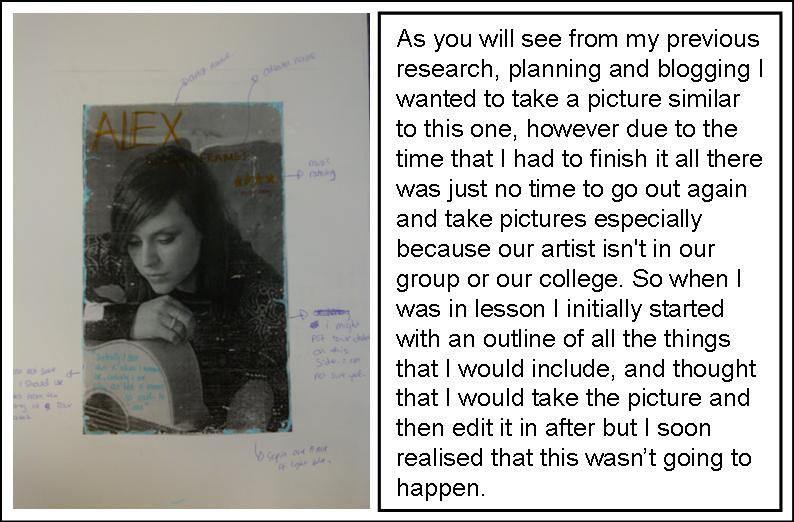
On thursdays lesson I did some last minute editing and rearanging on my advertisment before I declared it as finished and printed it out. These of some of the descions that I had to make and the things that I changed.
I was finding it very hard to place where the tour dates should go, it was very hard to place them because when i put them at the top, the middle of the advert looked really plain, and when I put it in the middle, her hand was in the way and you could'nt see some of the writing. There was also the question of whether to put the tour dates in back or white writing. Dan said that i shoud put the writing in white, however i thought that the white wasnt visible and it was hard to see again the noisy background. so i decidied to aks some other people, the verdict was: black.
everyone that i asked chose back, they said that it looks better like this.

 After I had establised what colour i was doing the writing, I had to go back to the problem of where to position the tour dates. After a long think made the text as big as I could and put them to the left, just below the middle of the advert. It fit perfectly, however it ment that I had to move my infomation circle... (the picture on the left) this was orinainally in the little space on the top right hand corner of my advert and it looked very nice there, but becasue ahd put the tour dates underneath the top was very empty so dans uggested that I move the circle and put it in the top left so that my advert would look more balenced. So I made the circle and the text bigger and out it on the left. After everything had been out in place i looked at the advert and was very happy with the changes, I think that they worked really well.
I went back to my digipak and i wanted to be sure there was not another way in which i could make my work better, so i asked dan to have one more look at it and tell me if there was any improvemnts that i could make. He said that he really liked my digipak and he thinks that it is very strong but suggested one little tweak that he thought would make my digipak better. He said that i should take the album name which was at the top underneath the artist name and put it at the bottom, he said that this would make the front look more together and whole. I made the change and i looked at it, and he was right it looked more wholsome.

I was finding it very hard to place where the tour dates should go, it was very hard to place them because when i put them at the top, the middle of the advert looked really plain, and when I put it in the middle, her hand was in the way and you could'nt see some of the writing. There was also the question of whether to put the tour dates in back or white writing. Dan said that i shoud put the writing in white, however i thought that the white wasnt visible and it was hard to see again the noisy background. so i decidied to aks some other people, the verdict was: black.
everyone that i asked chose back, they said that it looks better like this.

 After I had establised what colour i was doing the writing, I had to go back to the problem of where to position the tour dates. After a long think made the text as big as I could and put them to the left, just below the middle of the advert. It fit perfectly, however it ment that I had to move my infomation circle... (the picture on the left) this was orinainally in the little space on the top right hand corner of my advert and it looked very nice there, but becasue ahd put the tour dates underneath the top was very empty so dans uggested that I move the circle and put it in the top left so that my advert would look more balenced. So I made the circle and the text bigger and out it on the left. After everything had been out in place i looked at the advert and was very happy with the changes, I think that they worked really well.
 I went back to my digipak and i wanted to be sure there was not another way in which i could make my work better, so i asked dan to have one more look at it and tell me if there was any improvemnts that i could make. He said that he really liked my digipak and he thinks that it is very strong but suggested one little tweak that he thought would make my digipak better. He said that i should take the album name which was at the top underneath the artist name and put it at the bottom, he said that this would make the front look more together and whole. I made the change and i looked at it, and he was right it looked more wholsome.
I am so happy to have finally finished. YAY!
Monday, 9 January 2012


Thursday, 15 December 2011
PRODUCTION
In this lesson I was working on doing the Inside panels of the Digipak:

 |
| These are all the faces that I used in my digipak. I had to go through all the pictures and print screen the faces in all the same size because they all had to be equal because they were going to all be next each other. |
 |
| I then uploaded them all into photoshop, and put them all onto the Digipak so I could get started on sizing them and fitting them all in. This task was especially tedious and hard because I had to adjust each individual picture and fit it in as well as think about not ruining the picture for example not stretching it or making it too squashed. I spent a lot of time rearranging the photo's; putting different ones in different spots so that all the squares were the same. |
 |
| This is how it looked when i had finished putting in all the faces. It took a long time but it was worth it, I then had to put in the silhouette of the CD because this side is going to be the CD housing. |
 |
| As you can see I went to the shapes icon and I used the ellipse tool to make my silhouette. However when I put the circle on top of the faces, I saw that it covered all the middle part, so I went to the transparency tool and made it partially transparent so that you could still see where the CD was supposed to go as well as what was underneath. |
 |
| This is the transparency tool, you have to select the object or layer that you want to make transparent and change the 'opacity' from 100% to something lower. As you can see from the picture I have added a 'shape 2' because I wanted a smaller shape in the middle to represent the hole inside the CD. I made the transparency for this shape a little higher than the first circle because you have to be able to see it against the larger circle. |
 |
| This is how it looked when i first put in the circles, I still have to fix it so that they are in the right proportion so that it matches the conventions of a typical pop Digipak. |
I now had to work on the other inside panel of my Digipak. I have decided that this is the picture that i want to use for my inside panel. I think that this picture is really good for an inside panel because it clearly shows the artists and there is lots of space around her for text that I might add. I think that the location is very nice and it matches with the rest of the Digipak because it is to do with nature and natural beauty.

 |
I have decided to put this quote at the bottom of the inside panel. I think that this quote is appropriate for the the digipak because it ties in with the music video that we made. The quote says that you should always be your self, and this links in with the lyrics of the song for example some of the lyrics: " suddenly I see this is what I want to be, suddenly I see why the hell it means so much to me" these lyrics connotate that she finally see who she really is and she loves it, the whole song is about realisation of natural beauty and the emphasis on the diversity of the world. I have also added leaves on each side of the quote because it then links it with the front and back of the Digipak. |
PRODUCTION

In this lesson I was finishing off the front of my Digipak on photoshop.. I had to add all the little icons and the copyright information etc.
Firstly I went to the web and located a Digipak from the original artist, this was to get a feel of where I should put things and what I should write for the back of my Digipak. I started by zooming into the copyright information, I wanted to see what she wrote for her Digipak .
 This is the close up of her copyright information:


 |
| I then I minimised both photoshop and Internet page so that they were the same size and I could see both at the same time so that I could easily look at her copyright information so that I could have some guidance. |
 |
| I kept righting without stopping and as you can see it looks messy and looks like a lot of writing, this is because I haven't made the font small yet, and I haven't put the lines underneath each other so that it looks neat on the back of my Digipak. |
 |
| This is how it looked condensed down and made smaller. I also made the colour of the front white because it stood out more and was more readable than black. |
 |
| This is a picture of how my website looked against the background. I have decided to make this white as well, this is so that it will match the copyright information and also it stands out against the background. |
 |
I have added this barcode on my Digipak, The barcode is a necessary convention of a Digipak and you have to put it on the back of your Digipak. I have decided to put mine on the bottom right hand corner. |
 |
This is the logo of my record label, This is an important icon to put on your Digipak, you have to put this on so that the consumer knows which record label the artist is signed to. It is also really important because it promotes the label by being on the back of all their artists Digipaks. |
Subscribe to:
Posts (Atom)