My genre is; alternative rock, folks, blues, country blues.
 This artist is Sara Bareilles with her album 'Bottle It Up':
The good thing about this digipak is that it is simple, the photography is self explanatory, they haven't put any silly effects on the picture which makes it look really professional. They have used a one clear precise picture to promote the artist so the audience know what she looks like. You can tell that by the front of the digipak it is summer, this connotes happy emotions when you look at the digipak. The artist name and album name is very clear, she has used two fonts that work really well together, and they have followed the conventions of a digipak very well.
 The back of the digipack matches the front, carries on with the summery scene, They have used the conventional of a digipak; record label, copyright, bar code, track listing etc. The picture that they have used is similar to the front, very simple with no effects. the track listing front matches the front and it is clear and to the side so that the consumer can read it.

 The back panel for this digipack, matches the colour scheme to the front. The font is the same clear, white and readable. Even though this digipak is very simplistic it contains the conventions of a digipack for this genre. It includes a readable track listing, bar code, record company and a logo. However they could have added a little more on the back for example; copyright or a website adress.
 This artist is Eliza Doolittle:
 Her album covers are usually very creative and abstract; this album cover is very abstract. They have used Photoshop to manipulate images that they have put together, for example they have placed Eliza holding a statue with her leg over the gherkin. The strength about this digipak cover is that it is very eye catching and creative; this digipak will make people look twice. The artist name is on a white banner making it very prominent and bold.
 The back panel of the digipak follows the theme and colour scheme very well, it is graphic and creative like the front. The font that they have used is the same, and they have used the conventions of a digipak; bar code, record label, logo, copyright etc. I know that the font is very iconic to her image however i think that it is too hard to read; when i saw this it look very visually exciting but it took me some time to read the names of her songs.
 My audience would relate to the 1st 2 digipacks rather than the third one because they fit with the 'folk, pop rock, Soft rock, Folk rock, Indie folk, country blues' genre. they are targeting a similar audience and will follow the same conventions; this means that the audience will like them. They both use simple use of photos/ pictures, all different shot types. Also from a look at these digipack, we can tell you’ll be getting a mix of genres, not just one, you can see a little pop rock and folk as well, so this will interest the audience more, because it gives them an overlay of different genres.
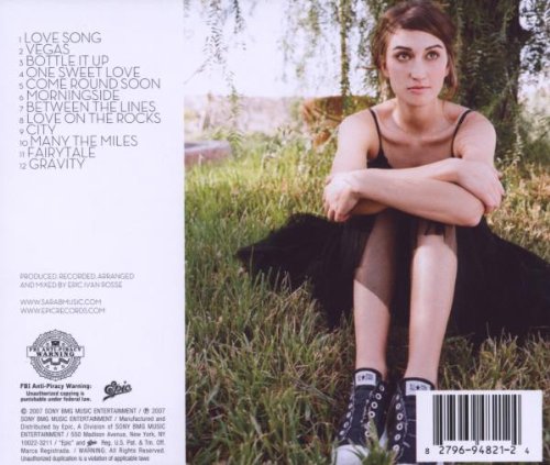 The back of the digipack matches the front, carries on with the summery scene, They have used the conventional of a digipak; record label, copyright, bar code, track listing etc. The picture that they have used is similar to the front, very simple with no effects. the track listing front matches the front and it is clear and to the side so that the consumer can read it.
This artist is Amy Macdonald with her album 'A Curious Thing':
The front of this digipak is very simple as well, close up of her face; she looks very simplistic and classy. The font of artist name and album name is really clear and bold, the consumer can easily read it from far away if they were in a store.
 The back panel for this digipack, matches the colour scheme to the front. The font is the same clear, white and readable. Even though this digipak is very simplistic it contains the conventions of a digipack for this genre. It includes a readable track listing, bar code, record company and a logo. However they could have added a little more on the back for example; copyright or a website adress.
 This artist is Eliza Doolittle:
Eliza Doolittle is not the conventional artist, she has a specific style which she follows through out most of her albums. As you can see from the picture below, her name is always in the same front through put albums, singles, promotion etc. They have used this very effectively because now when ever you see the type of writing, without reading it you would assume that it is Eliza Doolittle.
 Her album covers are usually very creative and abstract; this album cover is very abstract. They have used Photoshop to manipulate images that they have put together, for example they have placed Eliza holding a statue with her leg over the gherkin. The strength about this digipak cover is that it is very eye catching and creative; this digipak will make people look twice. The artist name is on a white banner making it very prominent and bold.
 The back panel of the digipak follows the theme and colour scheme very well, it is graphic and creative like the front. The font that they have used is the same, and they have used the conventions of a digipak; bar code, record label, logo, copyright etc. I know that the font is very iconic to her image however i think that it is too hard to read; when i saw this it look very visually exciting but it took me some time to read the names of her songs.


