Monday, 9 January 2012
Making the Front Panel
The pictures I went to take with Renee the first time didn’t really turn out so well hence I ended up not being able to use much. That’s why I had only had the back panel so far. After I went to take my pictures again I was able to move on with my digipack. The next section I attempted was the front panel.
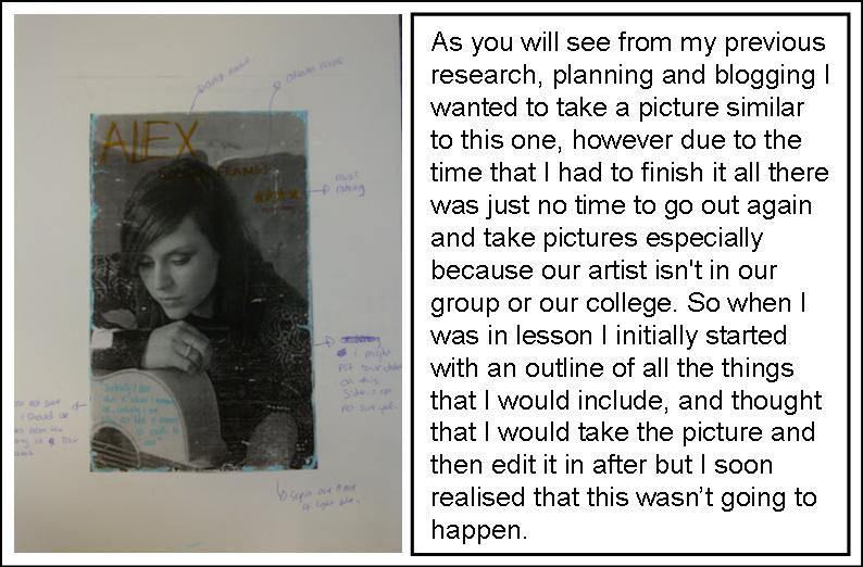
My mock up idea for my digipack was this:
So I put this picture of my artist on the front cover: (Insert picture) and then cut my artist out the background.
![]() |
| This was the front cover as just after i put the image in. |
![]() |
I tilted her to make it look more as if she was sitting on the guitar and pushed her a bit further back. |
The next thing I had to do was to add in shadows so it looks as if she is actually on the guitar, rather than that I just copied and pasted a separate image. I had to look at her and see where the direction of light was coming from. When I discovered that I was coming from the right I used the paintbrush tool and softly drew in some back lines.
To make the shadows soft I had to after change the opacity of the markings.
![]() |
Also used Filter – Blur - Gaussian Blur and change the radius of the blur to suit the desirable shadow placement to make it actually look like shadows. I used Gaussian Blur so that I could give the shadows a fade to have a soft edge and not so hard. The shadows make the image also look more 3D. In the end I put in shadows for legs, fingers, leaning arm and where she was sitting.
![]() |
| Adjusting the Blur |
After putting my artist on the guitar I added in the font to see had it would work with it.
![]() |
Here the font looks faint and it doesn't stand out as much as it needs to |
So I used the effects in Photoshop to try make my font stand out more.
![]() |
| I played around with the different font styles to see which one worked the best. I chose Outer glow because it make it come off of the page more and helped it stand out. |
But I didn’t think that was enough.
![]() |
| I continued to played around and added the Bevel and Emboss effect because it really allowed the lettering to stand out. |
This how it looked like when I was done and had added in a few of the floral graphics.
However, I showed Rebecca what I done with the font today in class and she informed me that she didn’t believe it stand out enough, and I agree. So I am going to go home and try out more effects and see if I could somehow make the font work conventionally, then asked a teacher advise on the improvements.
Floral Graphics
I found a drawing that my sister did of some flowers and I thought it would look nice on my digipack. So I asked her if I could use it, she said yes, so I am.
![]() |
| This is the drawing, but as you can see it scanned through really faint, so I definitely needed to use the pen tool to go over it. |
I scanned the drawing onto Illustrator, and like with my font name, I used the pen tool to go over the drawing.
![]() |
| This is what it looked like when I had almost finished going through it using pen tool. |
I plan to use these floral graphics all throughout my digipack, to make it be another visual link. Also I will add different colours on the florals to make it look more interesting.
![]() |
This is it all gone over in the pen tool, with some parts of it already shaded. When I use it I plan to colour them in and use pieces of the drawing at a time, not just in one chunk. |
Digipak: In Progress
This is what my digipak looks like so far.
(Add Picture)
From my initial designs you can see I have made some changes. For instance, instead of carrying the front background onto the back, I put a close up photo of Renee.
Also, I haven't used any sepia colour on my album.
Need to complete....
Short list of photos that plan to use in my digipack
![]() |
| This is the shot of the guitar that I want to use for my front cover that i will have the artist sitting on. |
![]() |
| This is the shot of the guitar that I will use in my advertisement with my artist leaning against it. |
One day before the holiday I met up with Renee in angel so that we could take pictures of her with and without the guitar. The first picture shot i focused on were the ones on the big circle in Islington Green park, so that could use that curve position to make it look as if she is sitting on the guitar in my cover. Then we went to college so that I could use the photography studio to shoot pictures of her and the guitar and some close up shots. However, the shots i took that day didn't turn out so well expect for the one for the back panel and her with the guitar. So I used the holiday to plan properly what shots I need to take, how I want her to look, what I want her to wear and how I will take the picture. After i planned everything I called Renee up and asked her if I could take the pictures again.
This time round, I went to Renee house so that i could help her pick out her clothes. I decided that I wanted her to wear different clothes throughout the digipack, because with actually digipacks, they never wear the same clothes, except the front cover outfit and advertisement outfit is he same - and that is what I have done. After we chose the outfits, I asked her to do her hair and make up, I brought straighteners for her to use and offered to do her hair, but she could do it. I don't wear make-up, so i couldn't bring her any, but lucky she wore a bit so she put on her make-up and we made do.
After that was done, I took the close-up and inside panel shots in her house, then we went back to angel to the big circle to take the front cover shot. After that I crossed the road so that she could lean against something to take the advertisement shots. The pictures turned out well this time so i had something to work with. Here is the short-list:
![]() |
| I will cut out and use this picture of her where she is sitting on the guitar. |
![]() |
| Or I will cut out and use this picture instead, I will decide when i see how they will look on the guitar. |
I had to make sure that for the pictures for the front cover that she is sitting on a curve because when i cut the pictures and then try to fit them onto the guitar her body has to curved also so that it looks like she is actually sitting on the guitar and look realistic.
My pictures for the back panel are:
![]() |
| OR |
CD Housing:
![]() |
| OR |
![]() |
| I like this one more though. |
Inside left panel:
![]() |
| OR |
![]() |
I liked this picture for the advertisement for her to be leaning on the guitar. Compared to the rest there wasn't much competition so there is no 'OR' picture for this one. |
None the less, I took loads more pictures and if any of these don't work out too well I can use a different one because I took a lot of pictures for my back-up/mock-up digipack drafts ideas - just in case.
Thursday, 5 January 2012
Progresss......
This is an image i got from the acural video of the sky. I wanted this image to put in my digipack. On the panal of where the CD is placed.
This is another image i got from the video. I really really like this image of the way it has been shot. Its very interesting and different so i thought it would look quite interesting if i used it on my digipack. (original image).
Here is the image again. I used photoshop: Tool:Brightness&Contrast. I used this image and edited it. To make the image stronger and brighter as i wanted my whole digipack to be quite bright and colourful. So i just fixed this image up.
Here is the making of the digipack. Start. I placed the cloud image on the right hand side panal of the back on the CD cover part.
Here i placed the other image on the left hand side of the back panal. So far this is how the back panal is looking.
Then i made a circle shape using the shapes tool on photoshop for the CD cover. I then fadded it so you can see the image behind.
I then got an image from stock image of a guiter. I used part of the image, cropped the background out and placed it on top of the CD. I wanted this kind of theme, with the guiter because it goes with the music video.
I made the guiter much bolder. By using the blending options on photoshop.
I then Added text on the CD cover of the artist name. 'Alex'. I also added floral flowers at the background of the CD quite fadded. I did this at home using the brush tool. i downloaded photoshop brushes of flowers, and i used them. I wanted this floral theme and i think looks quite nice. :D i am proud of my work so far. I also made the left hand side image brighter.
SO this is the FINAL Look of the back of the digipack. I showed my teacher and got some feedback. 'He said it looks very nice, but the image on the left hand side is just abit to bright'. So after the feedback, i fixed the image up and now is not to bright. OVERALL DIGIPACK. I hope you like it :D.
First Day Back......
Today is our first day back from holidays :(. And Still Got quite a bit to do. In this lesson i was carrying on with my digipack. I did Most at home as i have photoshop at home, However its not the new photoshop not updated but still works :). Below is the progress of my digipack so far....
This is the original picture that i took of the artist. I went out in my spare time and took some pictures. As i did not have an amazing camera the pictures were not too great (quality), but was good enough to use, and i took them in different angles.
Now this is the edited picture. I used photoshop. !
I used photoshop. I used the tools of brightness and contract, and hard light. I made it brighter and made the contrast more visible, because i wanted it bright. This image i am going to use this image at the front of the digipack. Been the main image.
Here is the Two front panals. So far i put the edited picture as the main cover. In the second panal i have already explained how i got the background, so i just added the track listing and put them in a nice order. I also added the bar code.
Here is an image i took of leaves because i wanted a floral theme. As i got told to take pictures of flowers and etc. So here i took a picture of leaves and now i just took away the background. I want to add this on the front panal as a faded image for the theme.
So i took away the whole background. I made the leave better by editing it. i used hard light.
So here is the finished Digipack. I put the leaves as the background quite fadded on the second panal as you can see. I added the production lable and the other information and etc. I added the text 'Alex".
Subscribe to:
Posts (Atom)


