Monday, 23 January 2012
EVALUATION QUESTION 2 - How effective is the combination of your main product and ancillary texts?
I answered question 2 using Beeclip, which is a type of interesting and fun presentaion.

Saturday, 21 January 2012
Evaluation Question 4...
4. What have you learned from your audience feedback?
Okay so i didnt get loads of feedback on my music video because i was not able to find them in the hard drive anymore. the feedback from the screen on the green. I also lost some feedback from before. So i have one qwick feedback for my music video.
Below are all the comments i got fore my ancillary Product. I put it up on facebook so my friends can see and comment on it aswell!!!

So here is the overall feedback i got from the Digipack and the advetisment. I got 2 Positive feedback :).

Here Is the front panal of the digipack. I got '6 Likes' and One comment. :D

Here is my advertisement and i an equal feedback, with some opinions. :) This comment was mainly positive and the only critism i got was about the bar code which is not a big deal, but overall i find the comment quite fair. and i am happy with it.
This is feedback from my Teacher Dan.
Dan said the real streath of my digipack is the quality of the photography. The shot is framed really nicely its really well lit and really nice. What I haven’t done is which is an easy thing to do is which is graphic and layer is that I have not ruined is with top grapy the typography is quite nice and does not spilt it at all and looks really good nice simple clear fonts same green theme which is continued at the back which is really really nice and consist and works really well with the font a nice piece of design.
From this feedback I don’t really see any negative comments been made. I happy very happy with the feedback from my teacher and don’t see what I could have done better.
‘ He said its really good, The font the different use of font of where I used bold and non- bold etc its really goes with the background, used really nice affects, what I wanted to show really stands out. I used the same kind of thing on the back panal, but its for a different reason, but still really stands out. He said he really likes the background of the back panal, it imitates some of the examples we used for the digipack. Also he mentioned how I used the font bold and normal, maybe it be hard for someone with less vision might be harder to see but apart from that its really good’.
Well here again. It’s a fantastic comment great feedback. Mostly posistive, which I am very happy about again. I think from these feedback it tells me how much effort and hard work I have put in to receive comments like this. He didn’t mention nothing to major that was negative. Well now thinking about it well maybe it be hard with people with bad eye sight to see it properly, but is not too much of a big deal to change because the font is not that bad, it is okay to see.
This is valaza and she is from my media class who also gave me feedback. !
'She said its really good, she really likes the front cover especially, the close up of the artist face is really good for establishing the artist, she likes the colour scheme, looks autum theme with the oranges greens, also she likes how I used the same image for the advert, its good shows a good link between the two, also how I used just an imagie for the front not for the whole thing. She said I could have used more pictures on it to extablish the artist abit more'.
Again mostly positive comments. I am really happy about. The only concern she said was about establishing the artist more, about adding maybe another picture of the artist. Well I agree with the comment. Now thinking about it I think I could have established her abit more. However The reason why I did not put another picture of artist is because my image at the front already stands out really well. It’s a big close up which is clearly shown on the front cover quite well, so I didn’t want to add more pictures of her. However I have learnt maybe next time if the picture wasn’t quite quite zoomed in and big close-up I should add another picture of the artist to astablish her more. However overall I think its quite fair and there was not much negatives things said, which needs big improvements, so I am happy!
“He said he really like my front cover likes the color scheme, It’s a big picture of the artist which shows who she is, like the way the font as being used as well, goes from normal to bold, likes the inside the use of format, the guitar, and the picture. Likes the advert, how I used the same picture of the artist, the font is good, looks professional, the use of hmv, Itunes etc, and the website which looks really professional.
Wow! Some amazing feedback. No negatives. Well what can I say! I am overwhelmed again by the comments. How he said it looks professional. I am very very happy.
Overall with all my feedback I don’t see what I can improve on because most comments I got was really positive. I am very happy. Just shows how much effort you put in is what you get out. As I did work hard for it, to deserve feedback like this. I think their all-fair comments. I do not have much thing to say on improvements because I didn’t receive bad comments to improve on. However except one, which I think is fair, but isn’t something I would do differently because of how it is already. I have learnt a lot this year about how much time you put into something is it comes out. I worked hard which is the reason why most people really liked it and I got positive feedback. I am really happy with it. Also i think the music video is a great success but theres always more room for improvements and i think if we had more time to anything it would be even more better.
Thank you to all.
Evaluation Question 3....
3. How did you use media technologies in the construction and reasearch, planning and evaluation Stages?
I used loads of different technologies in the research planning and construction and evaluation stage. I used many hard wears including the Brand new state of art-


I used the memory which the footages where saved in and upload them on the mac computers to view all my footages I have done. Which also allowed me to import it on to my video drive.

I used another piece of equipment which allowed me to illustrate my planning and research was the flip camers. This allowed me to get audience feedback from my music video from the ‘screen on the green’ and also allowed me to also get feedback on my ancillary work. I also used this for group ideas, and teachers feedback.

I used mac computers for the editing of my video. Through this hardwear I was able to use soft wears such as Final cut pro, which can only be used on mac.

Final cut pro is a programme which allows us to edit videos profeccinally. I used this programme to edit all my video. I used this to add clip, cut in clip, add affects, videos matched to the beats, cross dissolve between clips, which I used in my video to introduce the night time.


Another piece of softwear I used was photoshop. This is an softwear which is highly designed to edit photos. This allowed me to cut, crop, brighten add affects n etc. I used this in my ancillary products to add affects to my images.

Handbreak is another softwear which allowed me to video format and to convert my footages to go on to my blog.

I used the internet to reaserach and look for ideas images and etc for both my ancillary and music video. I used google to get many of my sources for the reacherch part in this task.

Youtube was one important website for the music video part. It allowed me to look and get inspirations from artists, and find out more about how the forms and conventions are coorperated in videos.


This is the hard drive where i saved all my clips. The edited ones and etc.

Blogger is a highly visited programme which allowed me to document my work regurally.
Evalution Question 2.....
2. How effective is the combination of your main product (video) and ancillary texts (digipack and advertisement)?
Thursday, 19 January 2012
Evaluation: Question 3.
3. How did you use media technologies in the construction and research, planning and evaluation stages?


To film music video related stuff, like feedback and group sessions, we used FlipCams. They're really small and useful to have, whenever filming something important it was easy to just grab and film and upload. I used this to film feeback on my ancillary products and reactions to our music video after the cinema screening. Can you imagine having to carry around that big JVC around?


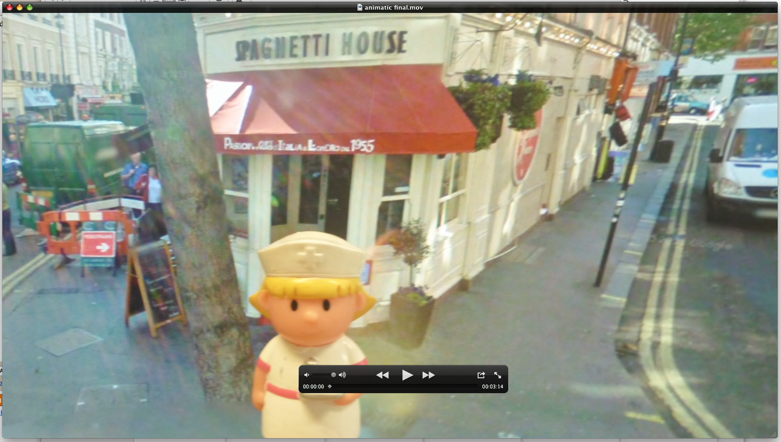
We created our animatic using the same program, but used Quicktime player to play it on. All the videos we had were watched on this program, something that just let you watch what you recorded really.


To make our ancillary products, I used photoshop. This allowed me to layer pictures and add text and effects to make the album covers and advert.


To present our pitch to the class, we made our presentation on Microsoft PowerPoint, where we were able to put all the information onto one document and present it to the class.


To document our journey we used digital cameras so we could take pictures of what we were doing so we could upload them on to blogger as proof. I used Prexi, a fun and interesting online website that allows you to create a presentations in a different form to answer a question.


Annnnnnnnddddd finally, the place where we stored and documented everything. The one and only, Blogger. We uploaded everything we did on here: from research to our pitch to editing sessions.

The amount of times I saw this when trying into log in. Worst nightmare.

Monday, 16 January 2012
EVALUATION
Question 4
What have you learned from your audience feedback?
Audience feedback:
I have put together the comments that i received and made it into a video, this feedback is on particular aspects of the editing, sound, mise-en-scene and lighting for my music video.
When we were at the cinema, I took a recording of our video playing in the cinema and the reaction that the audience gave, I also recorded some people outside so that they could give me some feedback on what they thought about the music video.
I think that we got a really good response to the music video, everyone cheered and clapped after it had finished. I also thought from the reaction, everyone liked the fact that there were people from our college that they knew in the music video. Even though I knew that I worked very hard in creating the music video, it was really nice to see what a group of people thought when they watched it. The response really made me happy because all the hard work paid off and it was a good music video. The audience liked it and cheered plus when I recorded individual thoughts on my music video; the feedback was really good.
I think that we got a really good response to the music video, everyone cheered and clapped after it had finished. I also thought from the reaction, everyone liked the fact that there were people from our college that they knew in the music video. Even though I knew that I worked very hard in creating the music video, it was really nice to see what a group of people thought when they watched it. The response really made me happy because all the hard work paid off and it was a good music video. The audience liked it and cheered plus when I recorded individual thoughts on my music video; the feedback was really good.
Feedback From Hanifah:
These are the main points that she mentioned: That the uses of editing and the cuts that we used in our video was really good. She said that her favourite part was how the people were walking past in fast forward, She said that she couldn't think of anything that we could improve on. --This feedback also boosted my spirits about how our music video would portrayed, and I am glad that we put those fast forward edits in the video, because for the individual this is what stood out.
Feedback From Conrad:
These are the main points that he mentioned: He said that overall he liked our music video, and he said that he especially liked the faces put together, however he said that the faces could all be the same size in the frame. In the end he said that we could have maybe improved on our lighting.
From his feedback I got a chance to look at how I could have improved my work and if I could change it would would i do differently. As you can see from the video he has said that we could have made all that faces the same proportion, I agree with this statement and think that the reason why we didn't manage to get every face the same proportion was down to our ability to talk to the public. When we were out filming the people's faces I was hesitant at first to ask people and it took me some time before I was confident in asking even if I got rejected. I think that the process of asking random strangers to record them was a new concept to me and I think that this is the reason why I wanted to film them as quickly as possible. This lead me to misjudge the proportion in which we were supposed to film them, leading to the different faces being of different proportion. From my audience feedback I have learned that If I could do this again I would change the approach I took when out filming, I would be more prepared and more confident in getting the filming done to a good standard.
 As you know from my previous post I created a survey using SurveyMonkey. I did this in order to find out what the audience would think of my ancillary products. I got three responses for my survey. These are the questions that I asked, and these are the responses that I received:
-I like that it's really realistic, and it looks like something I would actually buy.
-The colours and the layout
-The continued theme of autumn leaves
3. How do you think we could improve the front and back of the Digipak?
-Well personally I think it's excellent however I think that on main cover, the 'golden frames' is a tad hard to see, and would recommend using a different colour to make it attract the audience.
-Maybe if both the inside panels were covered in faces
-Although everything is autumn, and quite cosy, the attire of the person in the picture, does not compliment the whole theme. I.e I think if she was wearing a scarf etc and looked more...cosy? She just looks cold
4. What do you like about the inside panels?
-I love the faces, I think that compliments the song and the message.
-I like the faces
-Interesting concept of many faces, highlights that the music could potentially appeal to many different sorts.
5. Do both of the inside panels match or compliment each other?
-Yes they do
-A little. But if I didn't see the outside panels I would think it was a bit random
-Not really, you went for a diverse theme on the inside, personally i think the cover should highlight the diversity again.
6. How do you think we can improve the inside panels?
-I don't see much that you can improve.
-By having faces covering both panels
8. Have you got any more feedback?
-Nope.
-Overall, nice. I'm just being a massive critic. 'Patch'
--------
The feedback that I got from the survey really helped me reflect on what it could improve on. The reflections that I have made are that all of the sides of the Digipak could be more tightly linked because then it will pull the products together and help the audience feel as though it is complete and that all the products intertwine and link. From the feedback I learned that I need to be careful about getting my artist ready for the weather outside, because if the whether is cold and she is wearing clothes for the summer then it will look odd I think that what i could improve on is that I have to take in consideration variables that could change and i have to be more prepared than I was.
I also think that having audience feedback really helped me think of how I could improve if I were to do it again, because normally when you produce something your looking at it 24/7 and it's hard to spot if your going in the wrong direction and I think that I have learned that having a fresh point of view really improves your work.
From his feedback I got a chance to look at how I could have improved my work and if I could change it would would i do differently. As you can see from the video he has said that we could have made all that faces the same proportion, I agree with this statement and think that the reason why we didn't manage to get every face the same proportion was down to our ability to talk to the public. When we were out filming the people's faces I was hesitant at first to ask people and it took me some time before I was confident in asking even if I got rejected. I think that the process of asking random strangers to record them was a new concept to me and I think that this is the reason why I wanted to film them as quickly as possible. This lead me to misjudge the proportion in which we were supposed to film them, leading to the different faces being of different proportion. From my audience feedback I have learned that If I could do this again I would change the approach I took when out filming, I would be more prepared and more confident in getting the filming done to a good standard.
Feedback From Judith:
These are the main points that she mentioned: She said that she really liked how we put the faces together and she said that she liked that we used a fade in, fade out transition with the artists face and the lights at night. -- I think that from her response it showed me that it was good that we used the typical conventions of pop videos because these are the points in the music video that stood out, making the audience like and remember it.
1. What do you like best about this Digipak?
-I like that it's really realistic, and it looks like something I would actually buy.
-The colours and the layout
-The continued theme of autumn leaves
| 2. Does the front and back match or compliment each other? | |||
|---|---|---|---|
| answered question | 3 | ||
| skipped question | 0 | ||
| Response Percent | Response Count | ||
| Yes, They match and look good together |  | 100.0% | 3 |
| No, They do not compliment each other | 0.0% | 0 | |
-Well personally I think it's excellent however I think that on main cover, the 'golden frames' is a tad hard to see, and would recommend using a different colour to make it attract the audience.
-Maybe if both the inside panels were covered in faces
-Although everything is autumn, and quite cosy, the attire of the person in the picture, does not compliment the whole theme. I.e I think if she was wearing a scarf etc and looked more...cosy? She just looks cold
4. What do you like about the inside panels?
-I love the faces, I think that compliments the song and the message.
-I like the faces
-Interesting concept of many faces, highlights that the music could potentially appeal to many different sorts.
5. Do both of the inside panels match or compliment each other?
-Yes they do
-A little. But if I didn't see the outside panels I would think it was a bit random
-Not really, you went for a diverse theme on the inside, personally i think the cover should highlight the diversity again.
6. How do you think we can improve the inside panels?
-I don't see much that you can improve.
-By having faces covering both panels
-with a continued diversity theme, as opposed to having a picture of just Alex on the left. Maybe, have snaps of these other people, during day to day life, create a collage?
| 7. Does the front and back panels match the inside panels? | ||||||
|---|---|---|---|---|---|---|
| answered question | 3 | |||||
| skipped question | 0 | |||||
| Lots of links | Some links between them | Little links between them | No links at all | Rating Average | Response Count | |
| The font | 66.7% (2) | 33.3% (1) | 0.0% (0) | 0.0% (0) | 4.67 | 3 |
| The colours | 100.0% (3) | 0.0% (0) | 0.0% (0) | 0.0% (0) | 5.00 | 3 |
| The images | 66.7% (2) | 0.0% (0) | 33.3% (1) | 0.0% (0) | 4.33 | 3 |
| The layout | 0.0% (0) | 100.0% (3) | 0.0% (0) | 0.0% (0) | 4.00 | 3 |
-Nope.
-Overall, nice. I'm just being a massive critic. 'Patch'
--------
The feedback that I got from the survey really helped me reflect on what it could improve on. The reflections that I have made are that all of the sides of the Digipak could be more tightly linked because then it will pull the products together and help the audience feel as though it is complete and that all the products intertwine and link. From the feedback I learned that I need to be careful about getting my artist ready for the weather outside, because if the whether is cold and she is wearing clothes for the summer then it will look odd I think that what i could improve on is that I have to take in consideration variables that could change and i have to be more prepared than I was.
I also think that having audience feedback really helped me think of how I could improve if I were to do it again, because normally when you produce something your looking at it 24/7 and it's hard to spot if your going in the wrong direction and I think that I have learned that having a fresh point of view really improves your work.
Subscribe to:
Posts (Atom)